
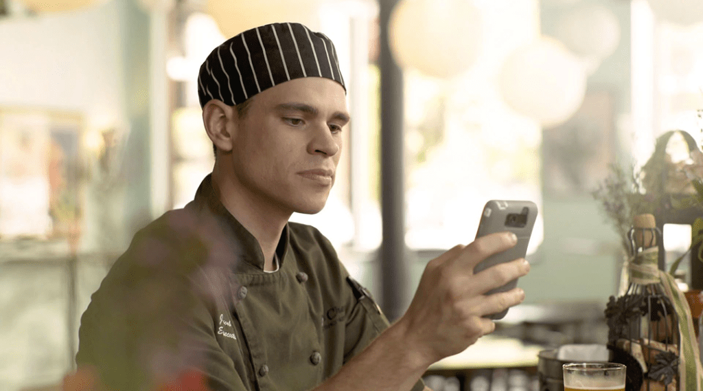
You want a great experience for every diner who opens the door to your operation. The same is true for your website, especially your mobile site. Many first-time visitors discover your business on their mobile device.
New customer or a regular, and no matter whether they’re using a tablet, phone or watch device, their experience should be as smooth as the service at your tables. Here are some ways to achieve that success:
Connect quickly and easily
A responsive website—an industry term referring to a site that conforms to fit screens of any size—is vital to success, Ken Seneff, founder of Restaurant Logic, a Jackson, Michigan-based website design company.
“Users hate to pinch, expand or scroll just to find the information they want,” he says. “A great site is a one-thumb experience.”
The numbers speak to this importance. A 2015 study by inMobi says 60 percent of internet traffic comes from mobile devices, a number expected to increase. And a Confluent Forms restaurant survey showed 53 percent of all mobile sessions began with a Google search. One of the ways to show up near the top of a Google search is to adhere to the search engine’s mobile-friendly specifications, which include having a responsive site.
See for yourself
According to Paula Buohl, Director of Communications at Text Ripple, an Asheville, North Carolina-based mobile marketing company, the best test of your site is to visit it as if you were a customer. “If it’s not responsive or doesn’t load quickly, there’s another restaurant just a click away.”
While most websites, when searched for on a mobile device, will show up and open; not all of them will display properly. The web pages won’t fit the device’s screen size correctly and some features on the website may not even work or be hard to navigate around. When your website is mobile-friendly, however, it means it is responsive. When opened, your website will display perfectly on the device’s screen, making it easy for visitors to navigate and get hold of your information.
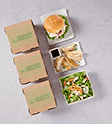
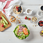
Menu your menu
One of the first things visitors look for is your menu, Buohl says.
“Make sure it’s up to date, and I’m a big proponent of showing prices,” she says. “Otherwise, I’ll think you’re out of my price range.” And when listing prices, always make sure the prices are current and use the same best practices you apply on your in-house menu—avoid currency symbols, don’t place them conspicuously in a line down the right side of the page, and round your prices up while always respecting the 99-cent rule ($10.99 will be perceived as a better value than $11.00).
Seneff says about 70 percent of customers will visit the menu page, and he points out that people aren’t likely to download a PDF menu, nor will they stay long if they have to squint at a JPEG menu. He advises breaking the menu into clickable segments—starters, sandwiches, desserts, beverages, etc.— to make viewing more manageable.
He also suggests trying to hook customers before they move on. “Offering a free appetizer if they sign up for your emails is a great way to get their business and engage them long term. “
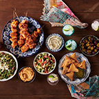
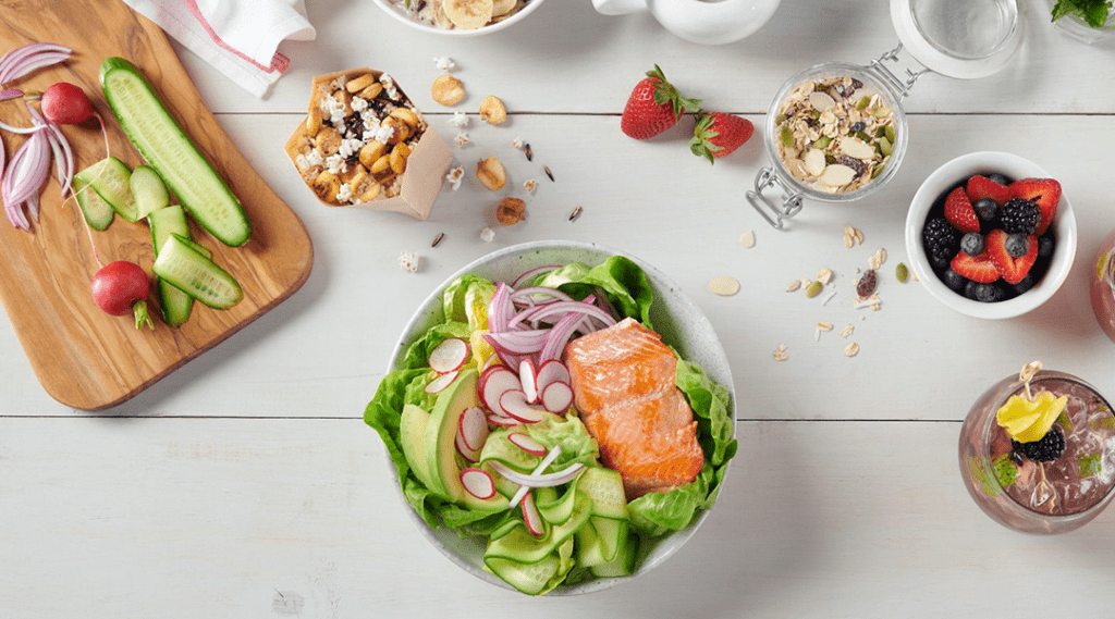
Tame the text, focus on images
Avoid text walls, Seneff says. Full screens of text that tell your restaurant’s story are not user-friendly.
“You need text more for Google search recognition than for customers,” he says. “If you have an “About Us” icon on your page, people interested in your story can go there, just make sure you add photos to add visual appeal.”
When using photos, whether on menu pages or elsewhere, Buohl says to make sure they are optimized, load quickly and are clear. “Everything is instant gratification, and if it doesn’t load fast enough, people will move on.”
Know the audience
Think mobile devices are for millennials only? Think again. The National Restaurant Association reports 40 percent of millennials and 26 percent of boomers are embracing mobile technology for their dining decisions. Meanwhile, 35 percent of customers from all age groups are more willing to use restaurant technology than they were two years ago.
Mobile device, app or social media?
Seneff advises operators not to think about an app without a mobile-friendly website first. RetailMeNot says one in four U.S. consumers have at least one restaurant app on their phone, but Seneff says most people don’t want to add more downloads—unless you have already engaged them through your mobile-friendly website.
“An app needs a purpose—a loyalty program, a ‘rate my bar’ feature or take-out ordering link if you have it,” he says. “It’s not a stand-in for a website.”
Buohl and Seneff both say social media is a good way to reach beyond your website to connect with customers, just make sure to keep active on the social sites you choose.
“Customer testimonials from those sites help sell your brand,” Seneff says, as does engaging with customers on social media.


 English